Bien Femme
Following the successful launch of Bien Femme’s CBD tinctures, I partnered with the brand once again—this time to design packaging for their new line of innovative beauty and skincare products.
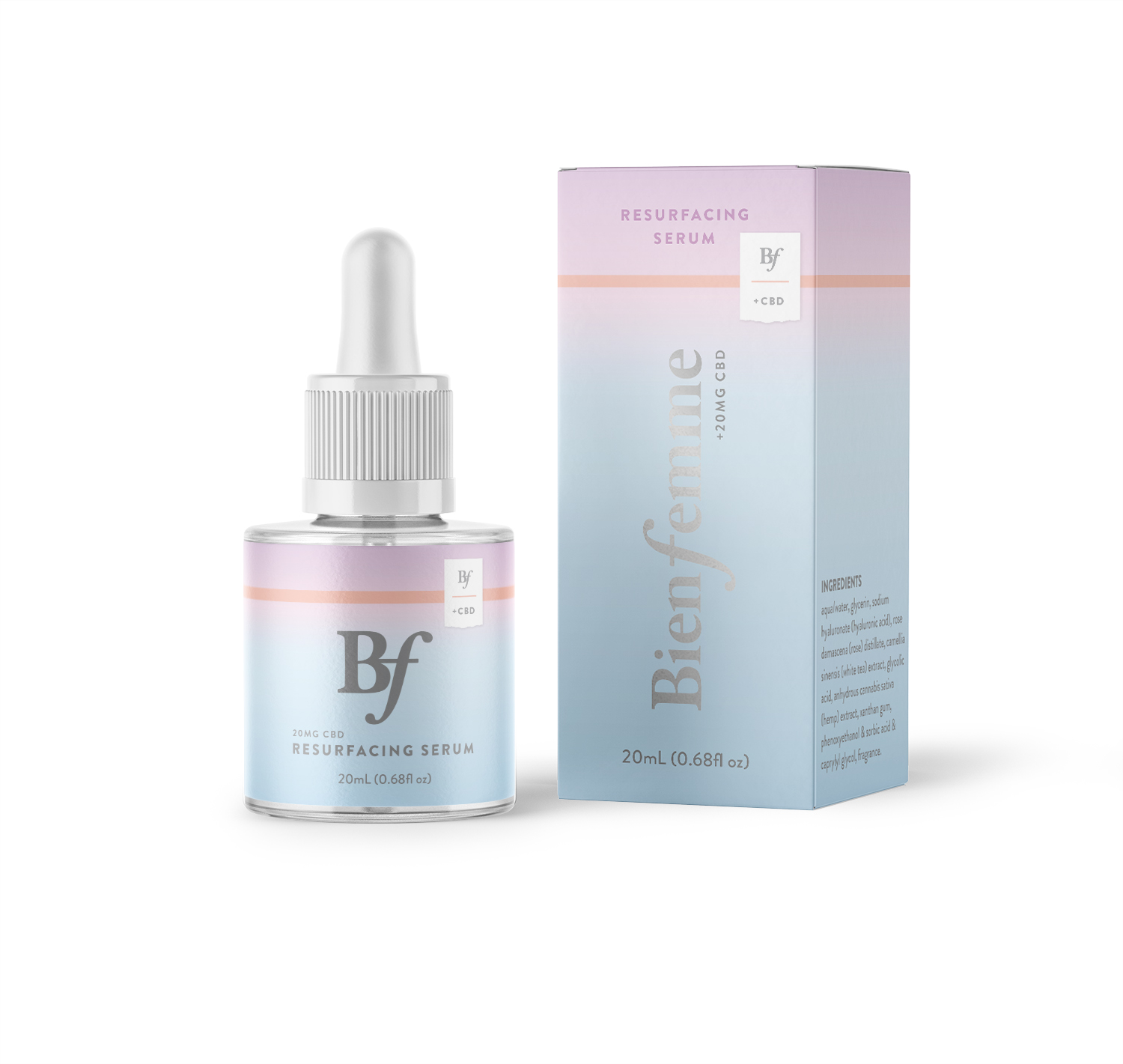
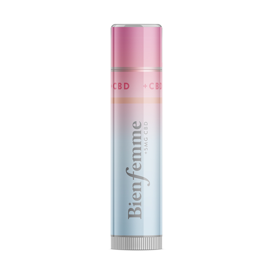
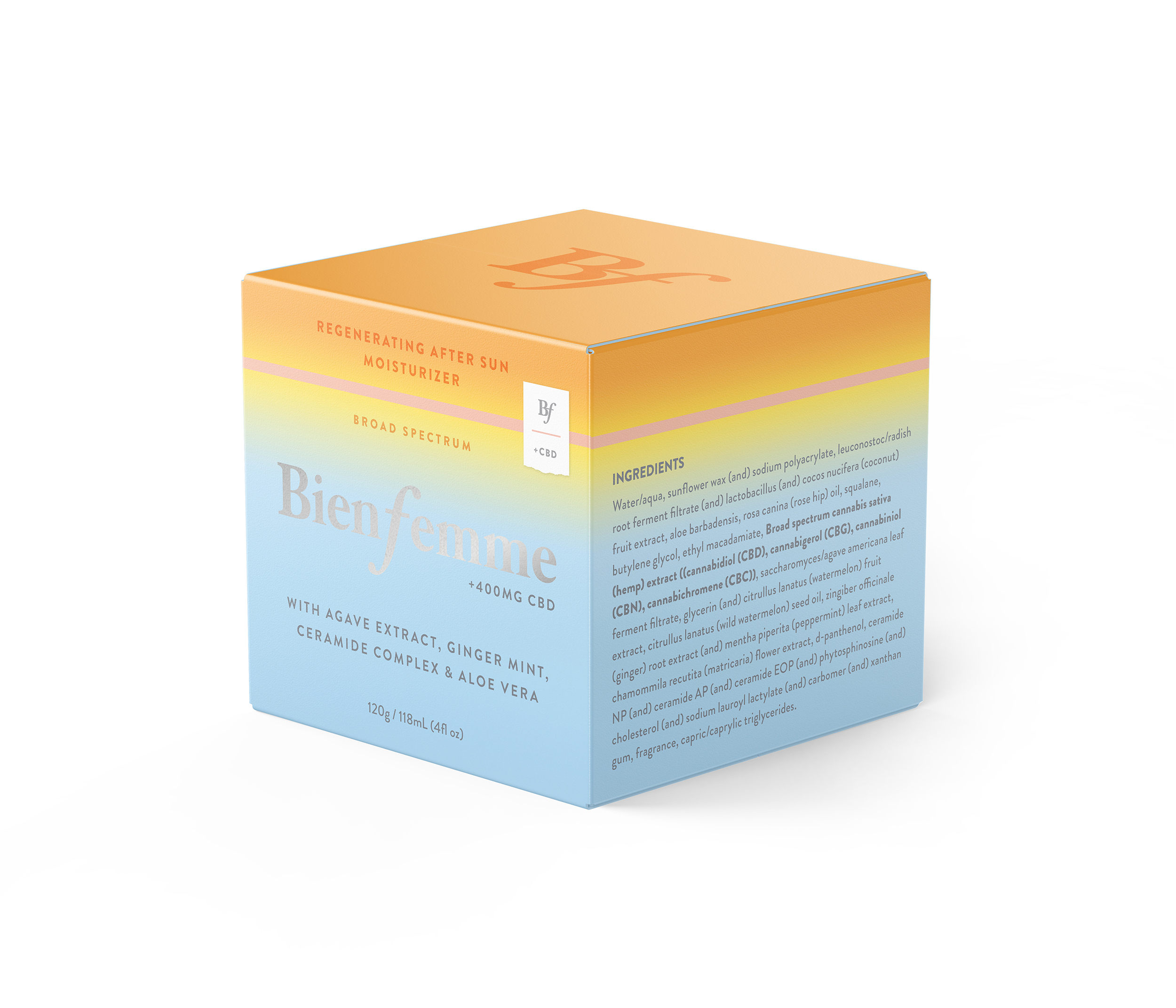
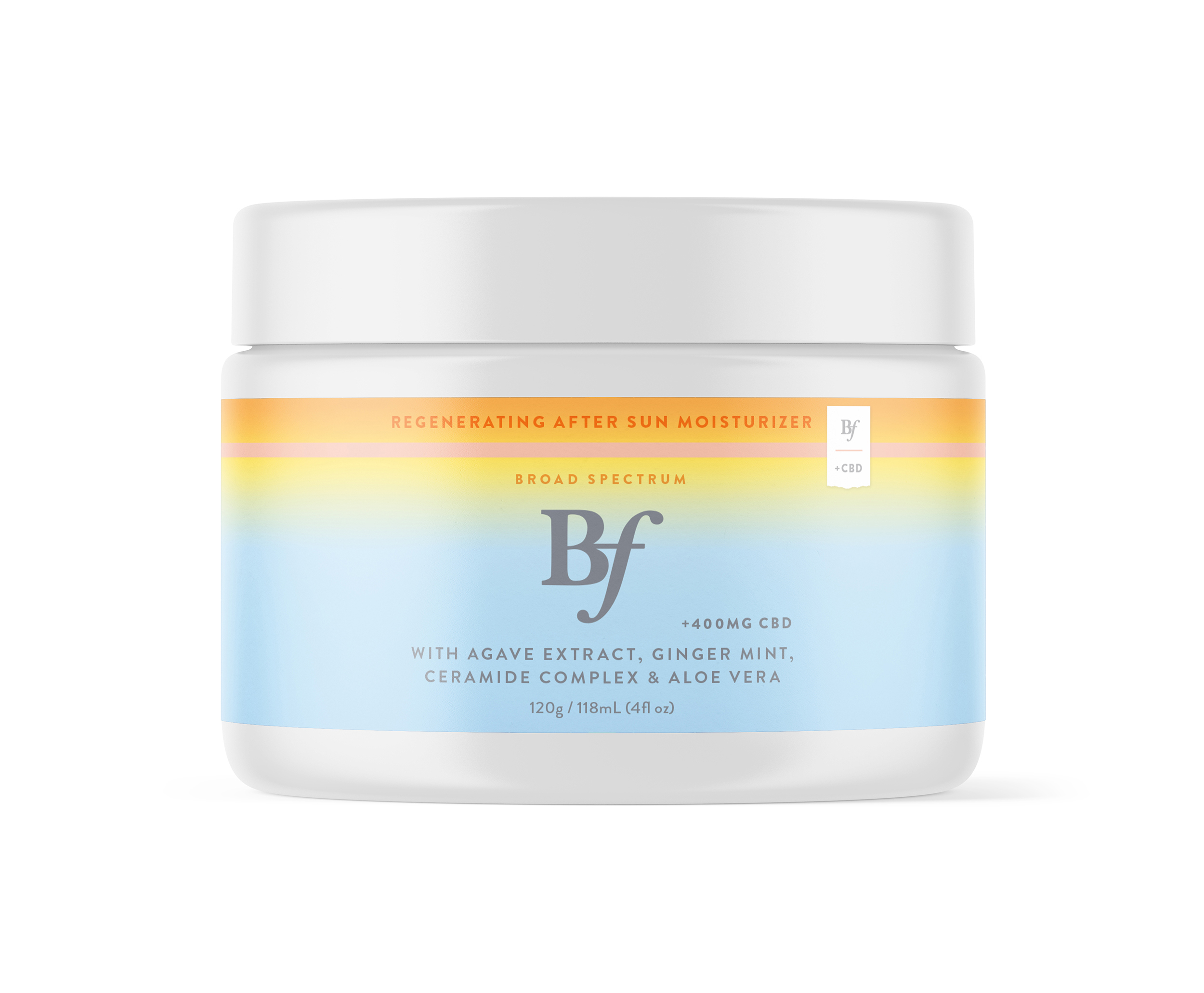
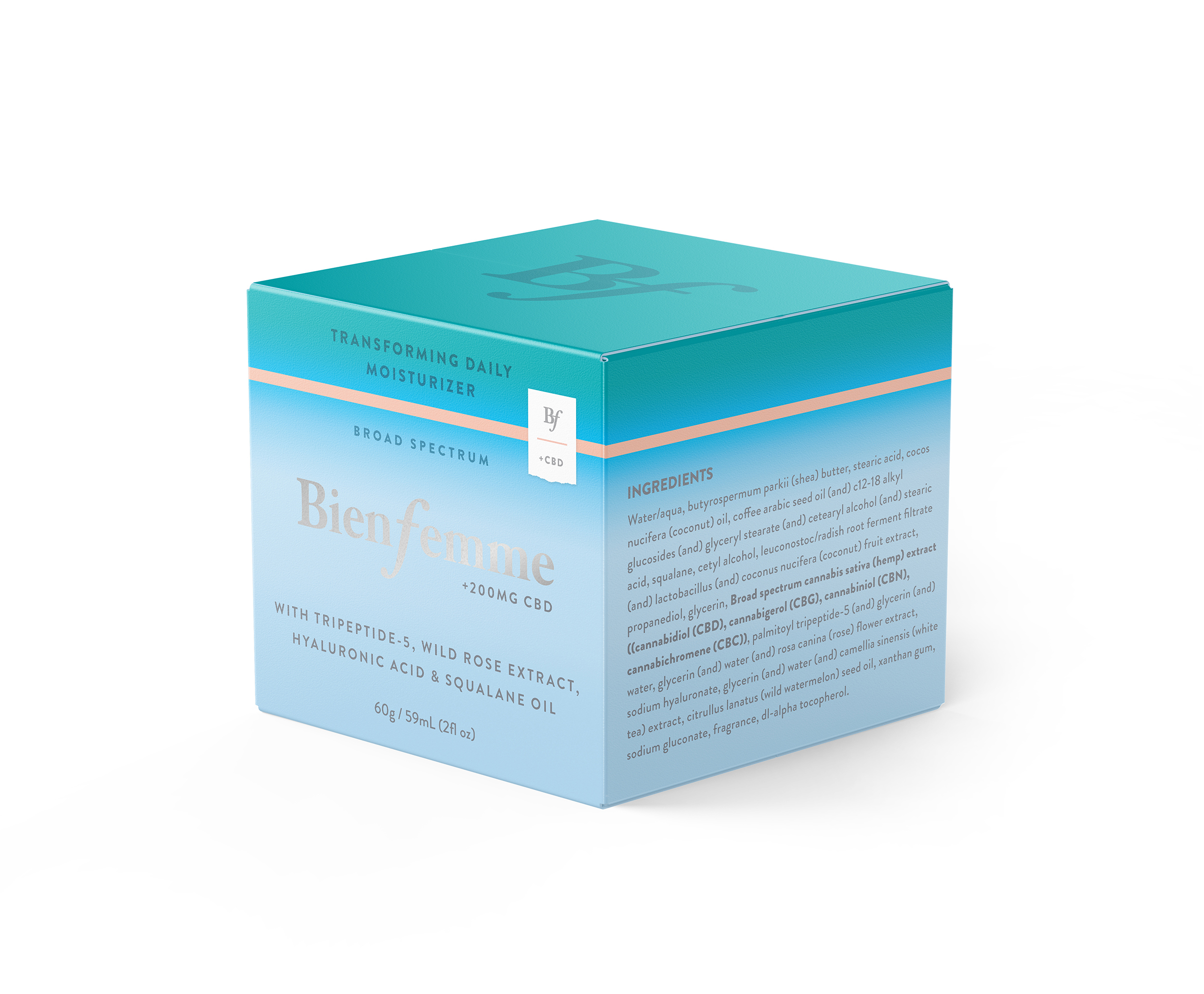
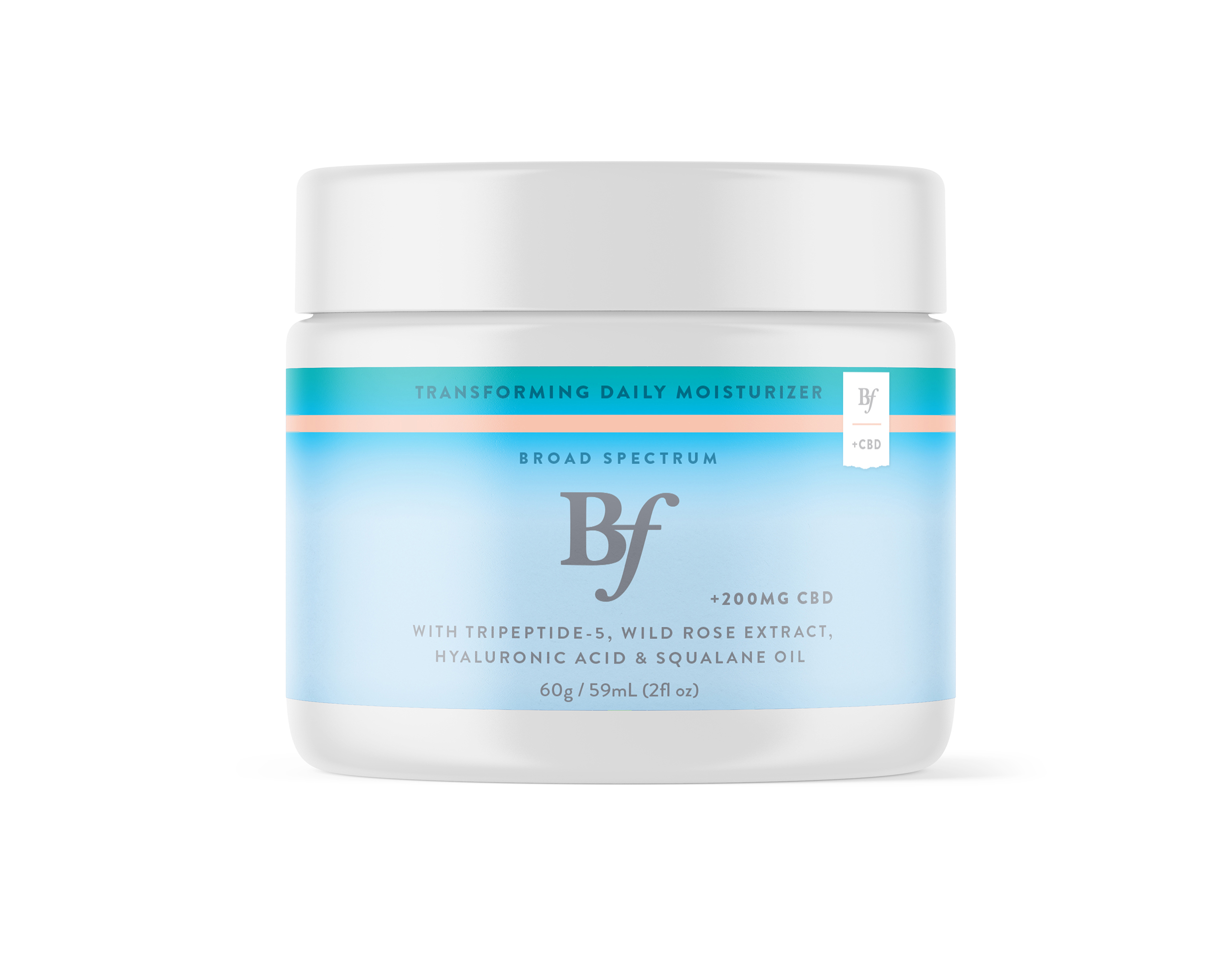
Building on the visual foundation we’d established, we retained the signature gradient while evolving it to suit a new product category. The updated look is vibrant, color-soaked, and sun-drenched—designed to evoke the energy of warm-weather adventures and beach-ready beauty rituals.
The system extended across a range of packaging types, including glass jars, aluminum tubes, and recyclable cartons—each with its own production considerations. We selected materials and finishes that felt elevated yet approachable: soft-touch coatings, metallic accents, and custom-label wraps that emphasized tactile quality and shelf presence. I collaborated closely with vendors to spec sustainable options where possible, aligning with Bien Femme’s values around clean beauty and conscious design.
Inspired by the brand’s bold, femme-forward ethos, the packaging is both sporty and elevated. It captures the active, confident spirit of Bien Femme’s audience while maintaining a refined edge across formats and product lines.
This collaboration reflects Bien Femme’s growing evolution from a niche wellness startup to a full-spectrum lifestyle brand. Through thoughtful color choices, material considerations, and consistent typographic treatments, the new line feels like a natural extension of the original—but with its own distinct point of view.
The result is a cohesive yet differentiated packaging system that signals category expansion while staying rooted in the brand’s original voice: bold, fresh, and unapologetically femme.